View
Epic Branding · Product Design
Designing purposeful product experiences — packaging, physical goods, and digital products that communicate value and function beautifully in the real world.
Product Design · Washing Powder Brand · 2024
Washing Powder · Packaging · Brand Identity
Clean · Bold · Powerful
The Concept
The name Impact drives every design decision. Bold letterforms, high-contrast colour blocking, and dynamic layout create a visual language that communicates strength and reliability at a glance.
The Typography
The Alpha typeface anchors the logotype — a bold, geometric sans-serif that conveys confidence and modernity. Its strong presence ensures legibility across all packaging sizes and formats.
The Packaging
Designed for real-world shelf impact — the front and back packaging layouts balance brand expression with functional information, ensuring clarity without sacrificing visual power.
The Market
Positioned for the everyday South African household — a product that feels premium and purposeful without being inaccessible. Designed to earn trust through consistency and confidence.
The Impact logo was developed across three colour expressions — each maintaining the same bold typographic foundation while adapting to different background contexts and applications.
A rich, high-contrast palette built on deep navy and vivid purple — commanding authority while maintaining visual energy and brand distinction across all touchpoints.
Deep Navy
Vivid Purple
Bold Blue
Deep Plum
Pure White
Aa
Alpha
Primary Logotype · Display
A bold, geometric display typeface chosen for its commanding presence and strong brand recognition. Alpha communicates confidence and modernity — perfectly aligned with the Impact brand proposition.
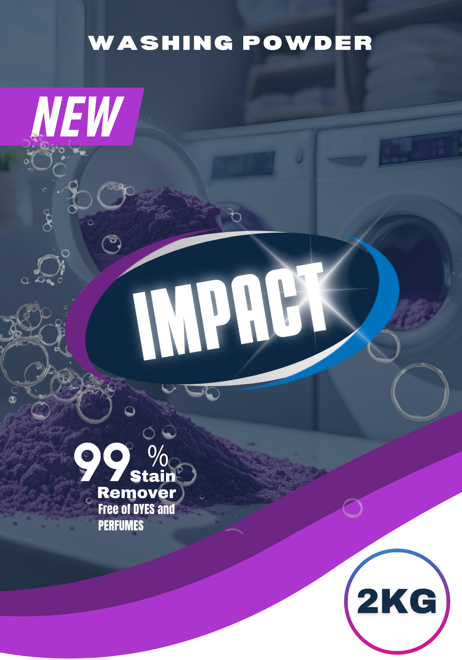
Front and back packaging layouts designed for print production — balancing bold visual branding with clear product information and regulatory requirements.
.png)
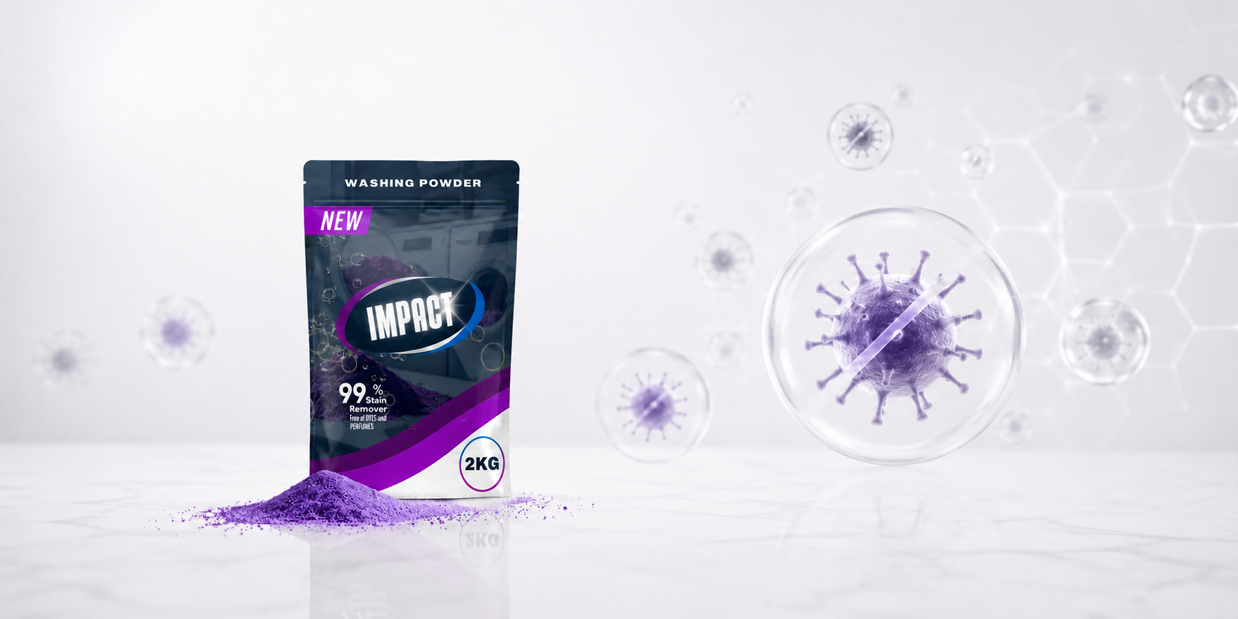
Real-world product visualisation across multiple angles — demonstrating how the Impact brand identity translates from screen to physical packaging with confidence and consistency.

.png)
.png)
.png)
.png)
.png)
.png)
.png)